Data Visualization
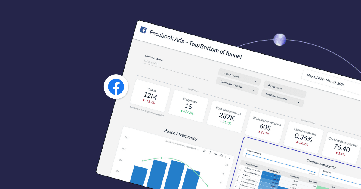
Turning data into visuals using suitable graphs and charts is a great way to monitor your campaign performance and communicate the results with different stakeholders. In this article, we’ll show you step-by-step how to build an actionable dashboard using one of the most popular data visualization tools among marketers—Looker Studio. Navigate this post: Navigating Looker ...
12-MINUTE READ | By Kathy Murillo & Isha Shinde
When it comes to data visualization, Looker Studio and Power BI both have their own strengths and weaknesses. Rather than pitting them against each other and deciding which tool deserves the crown, it’s better to understand which one works best for what scenarios. In this article, we’ll review Looker Studio vs. Power BI and help ...
7-MINUTE READ | By Milja Nevalainen & Joy Huynh
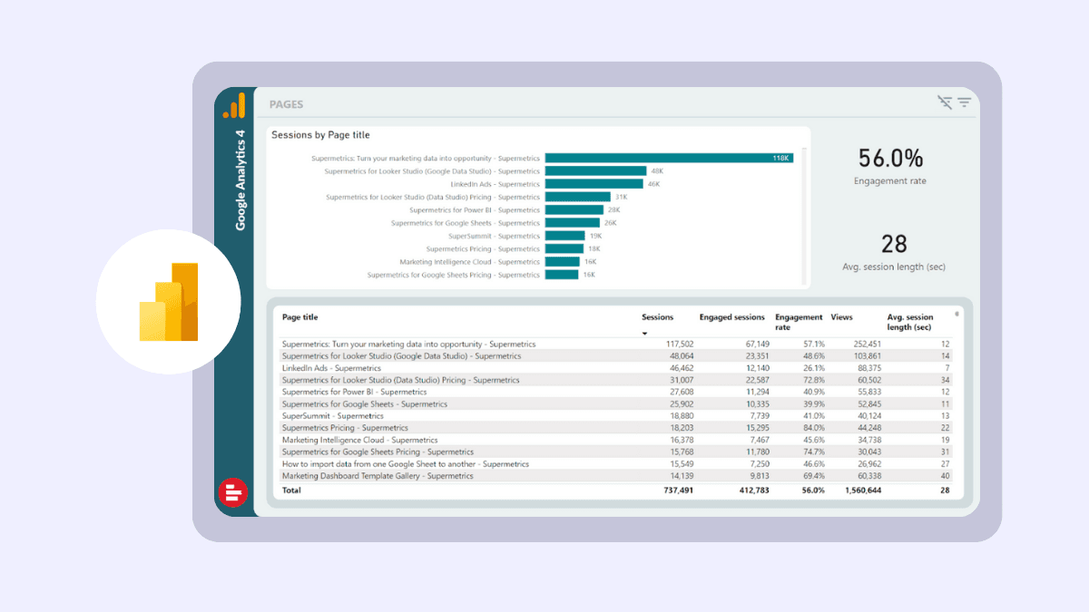
Let me guess. You’re here because you want to overcome Google Analytics 4’s UI limitation and have more freedom to customize your reports. Bringing your data into Power BI is a great way to stay on top of your website performance without any restrictions. In this article, I’ll discuss two common methods for exporting GA4 ...
4-MINUTE READ | By Jessica Wei
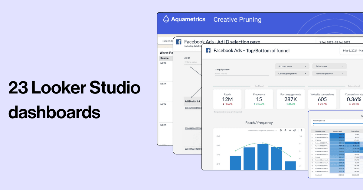
Using Looker Studio is an easy way to connect your cross-channel data sources and visualize your performance. In this blog post, we share 10 must-know Looker Studio tips for marketers to help you create better and more efficient dashboards. ...
15-MINUTE READ | By Fanny Heimonen & Ralph Spandl & Milja Nevalainen
Let’s be real: simple bar graphs and pie charts have become stale. If you want more striking, detailed, and — best of all — free ways to communicate your insights and visualize your data, you need to check out these bold alternatives for Looker Studio. Community visualizations have become a substantial part of Looker Studio ...
6-MINUTE READ | By Ralph Spandl
1
2Stay in the loop with our newsletter
Be the first to hear about product updates and marketing data tips
