Feb 10, 2020
Connecting Tableau to Google BigQuery: how Inseev tracks campaign performance
By Supermetrics
[ Updated Mar 9, 2023 ]
10-MINUTE-READ · By Jessi Carr & Eddie Zaldivar (Inseev Interactive)
Inseev Interactive is a San Diego-based performance digital marketing agency founded in 2013. Although they were launched with a primary focus on SEO services, they quickly expanded into a variety of other services, including paid media management, CRO consulting, and affiliate management. Inseev has always been heavily data-driven, but as their client base and service offerings started to grow, so did their need for a unified solution for data integration. Inseev’s Jessi Carr and Eddie Zaldivar explain their approach to using a marketing data warehouse with BigQuery and Tableau in their reporting.
As a digital marketing agency, working with numerous data sources and multiple clients creates demand for a unified view of marketing performance data. With Tableau and Google BigQuery, we at Inseev created a way to follow our campaign performance utilizing a multi-channel dashboard. Why did we need one in the first place and how did we create the dashboard? In this article we’ll explain exactly how we did it so you can replicate our success.
Try out Supermetrics for BigQuery with a free 14-day trial.
Moving from spreadsheets to a marketing data warehouse
In the early years of Inseev’s paid media department, daily account performance monitoring wasn’t a very time-consuming part of the job. We had a handful of small-to-medium spend accounts, mostly reporting directly off of Adwords conversion data. A few accounts here and there would need in-depth daily performance reviews (checking CRM data for lead quality, etc.), but even those only took a few extra minutes out of our morning to ensure that everything was running smoothly.
As time went on, we started to grow and began acquiring larger clients with more varied, in-depth reporting needs. Some clients requested channel-level reporting across advertising platforms such as Adwords, Bing, and Gemini (RIP). Others needed additional metrics such as customer acquisition cost with new customer data imported via CRMs, views of both GA last-click and search engine data with attribution windows and other related topics.
We realized that we needed a new solution to support these requests. Manually pulling and sorting data on a regular basis was growing increasingly time-consuming. This was taking time from optimizing client accounts and shifting more and more time to daily performance reporting.
Our initial solution was done using Excel spreadsheets with automated data pulls from Google Analytics, Adwords, Bing, Facebook, etc. This greatly streamlined our reporting process and cut down on our reporting time significantly, but was still far from a perfect solution. There were still multiple opportunities for errors, and on more than one occasion, clients informed us that the spreadsheet files were getting so large that they had issues with opening the report files we sent over.
As we began to integrate Tableau dashboards into our daily paid search review flow, we brainstormed around what our ideal daily performance monitoring dashboard would look like and what views would be most important for us to see on a daily basis.
We initially tried setting up our own API using a data engineer hired from UpWork but anytime the advertising platforms we used would release a new update, the data pipelines would break. It would take days or up to weeks before we had the pipelines running again.
At this point, we realized we needed a different solution and fortunately Supermetrics released their new BigQuery product just at the right time. We’d been using Supermetrics for Excel and knew the product well and that it was reliable, so it was a no brainer decision for us.
Creating Marketing Reports Using Supermetrics for Google BigQuery

Our inhouse daily performance monitoring dashboard gives us a view of the prior day’s performance, integrating whatever data we need to determine a client’s KPIs in one solidified report. Having this view available has allowed for a streamlined daily account review process, without the need to switch between multiple sources to pull and conglomerate data for each client based off of their specific KPIs (ROAS via engine data with 7 or 30 day attribution windows, CPA via GA last-click data, etc.).
We used Supermetrics’ native BigQuery connectors to automate our data transfers. We set up the initial transfers and after the initial configuration, we didn’t have to revise or update any of the regular transfers. With Supermetrics, all of the pipeline maintenance is taken care of and any changes to the way source platforms handle data are addressed with Supermetrics’ connector updates.
As any good paid media manager knows, daily performance is only half the battle. Fifteen orders hitting your client’s CPA in the prior day might seem great and not raise any red flags. If they’ve historically been getting 30 orders a day at that same CPA, you’d want to look into why sooner rather than later to get performance back on track. We needed a trended view that allows us to look at prior performance metrics and how current performance is faring versus prior performance.
Our dashboard delivers just that – a summary of the prior day’s performance, as well as how that performance compares to averages over the past 7, 30, and 90 days. The dashboard also provides a year-by-year view of orders, helping us surface any year-by-year changes. In addition to these summaries, we have charts showing conversions and KPIs over the past 30 days, helping our team quickly identify any days that may have been outliers in performance.
The results after implementing this dashboard have been great for our team. Reporting used to take upwards of an hour now takes minutes, giving us more time to spend working on our clients’ accounts. Team members who are new to an account or filling in on account management are able to quickly determine if performance is typical or anomalistic for an account, instead of digging around in notes or trying to pull data themselves.
Declines or increases in performance on a longer trended view are now able to be surfaced immediately. With our dashboard, we are able to identify changes immediately and correct for any errors. If our clients need any specific information about their performance, we can just pull up the relevant data in seconds instead of sending massive spreadsheets.
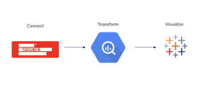
How To Create Performance Marketing Monitoring Dashboards In 3 Steps
This dashboard combines cost data from multiple platforms including Google Ads, Facebook Ads, and LinkedIn Ad, and combines it with GA performance data, which we use as a central point of truth for most clients. We combine the ad data with GA performance data to calculate metrics such as return on ad spend. This is all done by combining BigQuery and Tableau. To create this dashboard, there are three main steps:
- Connect
- Transform
- Visualize
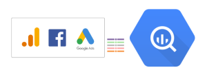
1. Connect
The first step is to connect the different platforms. We’ll extract data from our platforms using Supermetrics for BigQuery connectors. The connectors are readily available in the Google Cloud marketplace.
Step 1. Log in to the Google Cloud Platform, cloud.google.com. Click on the three lines in the top left-hand corner to access the menu. Click on Marketplace.

In the marketplace search bar, type in ‘Supermetrics’ and this will you the Supermetrics connection tools.
Select the platform you would like to use and set up the data transfers appropriately.

2. Transform
After extracting all the data and loading it into BigQuery, we have to clean up and combine the data to visualize it in Tableau. Data extracted from the systems is in a raw state, requiring transformation. Transformation is performed to normalize the data into a form that can be used for analysis.
Supermetrics takes away most of the work as they provide an easy to use schema that transforms the data automatically. No longer do you have to join multiple tables to combine account, campaign, adgroup names or unnest tables for Tableau. All of that is handled by the Supermetrics connectors.
After loading the data to BigQuery, we can use the BigQuery console to join and blend the data. This can also be done in Tableau, but BigQuery provides us with more computing power. This difference is noticeable, as using BigQuery brings our reporting times down to seconds as opposed to minutes with Tableau.
Things to remember when performing SQL operations.
- Make sure that all platforms use similar names for metrics. For example, Google Analytics does not use clicks, they use either sessions or pageviews. At Inseev, we consider clicks to be the same as sessions
- Customer/Client name may be different across the different platforms. Setting up case statements can help link similar names together
- Create a “Platform” column to identify data from the different platforms when comparing all platforms in a view.
- Hard Coded Campaign Tracking in Google Analytics can cause issues as it may be difficult to attribute campaign data in GA to the corresponding platform data. This occurs due to Dynamic tracking not being currently setup.
- Use Joins to create an aggregated view for Google Analytics to blend cost and impression data from the different platforms with Google Analytics data.
- Depending on your clients need or whether they’re Ecommerce or Lead Generation, you may be tracking different conversions for different clients. Use Case Statements to pick the appropriate Goal in Google Analytics.
- Use a Union statement to combine the different platform views into one table.
3. Visualize
After extracting data and transforming it, we can now connect Tableau to BigQuery.
Connecting BigQuery to Tableau is easy – Tableau has a native integration with BigQuery. Just select Google BigQuery from Tableau’s data source menu.

After authenticating, select your newly created data view and load the view into Tableau.
In order to create the time period breakdown, we need to do some extra calculations. It is very simple as showcased in the following example.
Creating a Time Period View
- Open a new sheet in Tableau.
- Right click dimensions and create a calculated field.
- Filter for the platforms you want to include by dragging the platform field into filters.
- Type in the following into the calculation formula field

- Drag the newly created Time Period Calculated Field into columns and the dimensions you want to see i.e. client, campaign, channel grouping, etc.
- Create an Average Daily Orders Calculated Field. Right click and click “Calculated field” and enter the following. This divides the total orders in the different time periods and divides it by the total amount of days.

- Create a Running CPA Customized Field. Right Click under “Measure and Create Calculated Fields” where you will create measures for a running CPA. This will give you the average CPA per day for the period you created in the Time Period Custom Field.

- Drag Running CPA and Avg Daily Orders into the Measure Values box or into the dashboard and it should populate the data for the table.
Create Dual Axis Graph
- Create a CPA customized field as shown below.

- Drag the appropriate dimension for you or your clients’ needs like Channel Grouping or campaigns and drag to columns.
- Drag date and select day by clicking into the downward facing arrow.
- Drag Orders to Rows and set as a Bar chart .
- Drag CPA to Rows and set as Line
- Right Click CPA button in Rows and click Dual Axis.
- Drag date to Filters Box and choose Relative Dates, click on the appropriate time window you want to see by clicking days and then last and entering the amount of days.

Combine Table and Chart into Dashboard
- Create a dashboard by clicking on the New Dashboard button in the lower pane in Tableau.
- Drag both sheets so that the chart stacks on top of the table and you’re done!
Extra Step for Agencies: if you want to have all clients in one dash, you can recreate the previous steps for all clients and then stack the tables and charts on top of each other. Now you have all clients in platforms in one view.
In summary
With Google BigQuery powering our data operations, we are able to create multi-channel dashboards for each of our clients. Having the computing power of Google BigQuery at our disposal, we are able to do reporting in seconds. Our data is always up-to-date and handled automatically without any extra maintenance work needed. Compared to our previous solution using spreadsheets, we get reporting results within minutes and can customize our presentations to suit specific time periods without any extra configurations.
Ready for the next step in your data processing? Get a 14-day free trial to Supermetrics for BigQuery and start building your marketing data warehouse.
About Jessi Carr

Jessi Carr is the Associate Director of Paid Search at Inseev Interactive. She enjoys crafting creative, data-driven strategies to help her clients grow, and especially loves working on (and perfecting) intricate product data feeds. You can connect with her on LinkedIn.
About Eddie Zaldivar

Eddie Zaldivar is the Senior Director of Analytics & Paid Media at Inseev Interactive. An unceasing self-learner who believes if it doesn’t break the rules of physics, it can be done. Just look at the data.You can connect with Eddie on LinkedIn.
Stay in the loop with our newsletter
Be the first to hear about product updates and marketing data tips