
10-MINUTE READ · By Pinja Virtanen
At Supermetrics, we’re big on making marketing reporting as painless as possible. That’s why we love using ready-made marketing reporting templates as a starting point for building any and all of our reports.
In this post, we’ll walk you through 31 of our favorite PPC reporting templates that you can swipe today.
Navigate this post:
Let’s get down to business!
PPC report templates for Google Sheets
If Google Sheets is your PPC reporting playground of choice, these 21 templates are for you.
Paid channel mix report for Google Sheets

If your paid channel mix consists of any combination of Google Ads, Bing Ads, Facebook Ads, and Twitter Ads, you can use this template to quickly compare your campaign performance across key metrics, including impressions, clicks, conversions, and cost per conversion.
Get the paid channel mix template >>
Detailed paid channel mix report for Google Sheets

If you’re looking to get a more detailed breakdown of your PPC campaign performance, this reporting template is for you. In addition to letting you combine high-level performance data from Google Ads, Twitter, Facebook, and Bing, you can also track daily performance, highest performing keywords, and ad set-level performance.
Get the detailed paid channel mix template >>
Detailed paid channel mix with Yandex.Direct report for Google Sheets
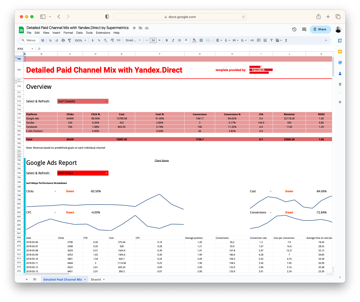
Similarly to the previous template, this report allows you to get more granular with your PPC performance reporting. In addition to the channels listed above, it also lets you track the results of your Yandex.Direct campaigns.
Get the detailed paid channel mix template with Yandex.Direct >>
Google Ads monthly report for Google Sheets
If you’re reporting to a manager or client who’s interested in seeing a detailed breakdown of your Google Ads results, you might want to give this template a go. In addition to the basics like clicks and conversions, the template allows you to review performance by additional variables, such as campaign, device, and country.
Get the monthly Google Ads reporting template >>
Google Ads ad copy & preview template for Google Sheets
When you need to edit Google Ads across multiple ad groups, you can simplify the task with this handy template. You can also preview your ads directly in the template and export all changes at once without any manual copy-pasting.
Get the Google Ads ad copy & preview template >>
Google Ads & organic keyword performance template for Google Sheets

If you’re like us and strongly believe that SEO and SEM shouldn’t live in their own silos , this template is for you. By figuring out which keywords perform well on Google Ads, but have a low visibility in organic search results, you’ll be able to optimize your content for organic search and increase high-quality traffic to your website.
Get the Google Ads & organic keyword performance template >>
Microsoft Advertising high-level monthly report for Google Sheets

Similarly to the high-level Google Ads monthly report, this template is perfect for agency marketers who want to provide an overview of their Bing Ads results to clients. From clicks to conversions and from cost per click to conversion rate, this template will help you communicate your biggest wins in a clear format.
Get the Microsoft Advertising high-level monthly report template >>
Facebook Ads high-level monthly report for Google Sheets

If Facebook plays a large role in your paid channel mix, you may want to give this template a try. It pulls the most important data from demographics to clicks onto a single tab, making it easy for your manager or client to quickly review your results.
Get the Facebook Ads high-level monthly reporting template >>
PPC reporting templates for Looker Studio
If your reporting platform of choice is Google Data Studio, worry not because we’ve got your back, too.
Paid channel mix report for Looker Studio

If you’re looking to use Looker Studio to compare and contrast the results of several different paid channels, this template is a great place to start.
Get the paid channel mix template for Google Data Studio >>
Google Ads vs. Facebook Ads comparison report for Looker Studio

This template is perfect when you want to compare the overall performance of your campaigns across two of the biggest advertising platforms: Google Ads and Facebook Ads.
Get the Google Ads vs. Facebook Ads comparison template >>
Facebook Ads overview report for Looker Studio

This visual report helps you clearly and efficiently communicate the performance of your Facebook Ads as compared to the previous period.
Get the Facebook Ads overview report template >>
LinkedIn Ads overview report for Looker Studio
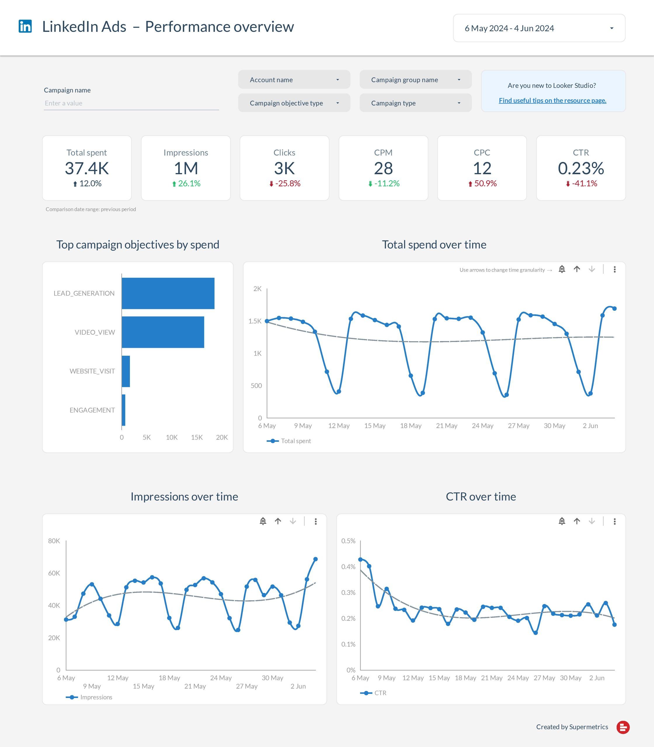
Similarly to the Facebook Ads overview template above, this handy dashboard allows you (and your clients and/or managers) to see the performance of your LinkedIn ad campaigns at a glance.
Get the LinkedIn Ads overview report template >>
X (Twitter) Ads overview report for Looker Studio

If you’re running Twitter ads on a relatively large budget, this template is perfect for showcasing the results of your campaigns. From basic metrics like clicks, cost, and conversions to campaign-level breakdowns, this reporting template works well as a high-level monthly overview.
Get the Twitter Ads overview report template >>
PPC reporting templates for Excel
If Excel is your reporting tool of choice, you might want to check out these three templates that can save you some serious time.
Paid channel mix report for Excel
If you’re running the same campaigns across several channels including Google Ads, Facebook Ads, Bing Ads, LinkedIn Ads, and Twitter Ads, this report will make it easy for you to compare and contrast the performance of each channel.
Get the paid channel mix reporting template >>
Google Ads overview report for Excel

If you’re running Google Ads internationally or on a relatively large budget, you may find this reporting template helpful. Use it as a client-facing document or an internal report to help non-marketers get a quick idea of which campaigns are performing the best across each geographic location you’re targeting.
Get the Google Ads reporting template >>
–––
I really hope you found some new ideas for your PPC reporting from these templates! And if you discovered a new favorite template, please let me know by tweeting at me .
Happy reporting!
Psst! Did you know that you can now get a free 14-day trial of Supermetrics? Simply choose your favorite reporting platform here and get started.
Turn your PPC template into a live, automated report
Start your free trial of Supermetrics to connect your ad platforms directly to your report templates. Skip the manual updates and deliver always-fresh insights with little effort.